
New
#21
Like 10 but that white background!
-
-
New #22
A break wouldn't help me I have eye floaters on white end of story. Black high contrast on a PC, no thanks.
-
-
-
-
New #26
I understand. No one likes what I like, apparently.You don't like, eh!
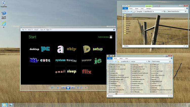
That's ok. For how I arrange the launcher, it is simple and clean and changeable.
Tiles can be made to all have the same color in high contrast. No childlike multicolored blocks.
Explorer backgrounds can be any color. Text can be any color.
It does affect IE, but can be instantly reset to default with 1 click.
And there are other browsers, like Maxthon, that are immune from HC.
IE colors can be changed to be different than HC.
Curious though, not liking white, blue or black explorer background, then, what color do you prefer?
I don't get the "in your face" thing.
A desktop full of icons or the 10 menu full of untitled mini tiles, seems to me way more annoying.
Funny how no fans of 10 are whining about
the kiddy playland multicolored toy block tiles now like they were with 8.
The concept of live tiles I find annoying as well.
I don't need to be kept up to date on weather / news / recent video streams / clocks ...
Windows Blinds is awesome. Unfortunately not ready yet for 10.
I have designed hundreds of customized start screens,
and get bored silly with default stuff.
btw, not using 10.
Don't have a system to waste on an upgrade.
Not paying $200 for 10 Pro.Last edited by nt62; 07 Aug 2015 at 10:58.
-
New #27
I installed the QT_tabbar addon for file explorer and not only did it add the tab functionality (which I love) but the explorer window is definitely not as white (a little bonus)
-
New #28
-
 There ya go!! Get up take an "Eye break" and look in the distance....

 Quote
Quote


 and you can play around a bit with the colours.
Related Discussions
