
New
#1
I find it hilarious and very insulting at the same time, that they keep blinding us with more bright white, while saying dark themes save battery life.

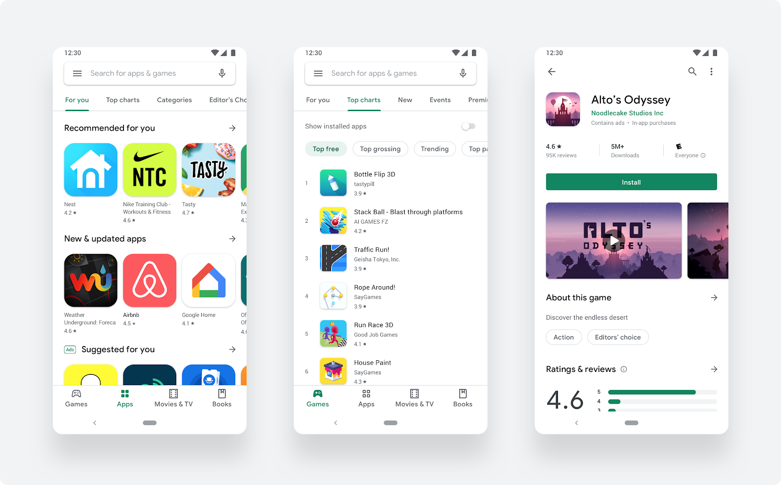
The Google Play Store has over two billion monthly active users coming to find the right app, game, and other digital content. To improve the overall store experience, were excited to roll out a complete visual redesign. Aligning with Material design language, were introducing several user-facing updates to deliver a cleaner, more premium store that improves app discovery and accessibility for our diverse set of users.
To make browsing faster and easier, weve introduced a new navigation bar at the bottom of the Play Store on mobile devices and a new left navigation on tablets and Chrome OS. There are now two distinct destinations for games and apps, which helps us better serve users the right kind of content. Once users find the right app or game, the updated store listing page layout surfaces richer app information at the top of each page as well as a more prominent call-to-action button. This makes it easier for users to see the important details and make a decision to install your app. Youll also notice our new icon system with a uniform shape, helping content to stand out more over UI. If you havent done so already, make sure to update your icon following the new icon specifications as soon as possible.
If youre looking for best practices to make a compelling store listing page, we have several resources to help. To ensure your page resonates well with Android users, use store listing experiments to test for the best app icon, images, video, and descriptions on Google Play. You can also tailor your marketing messages to specific user groups based on their country, install state or even pre-registration by creating custom store listings. For even more, try our free e-learning resource, Academy for App Success.
Source: Android Developers Blog: The Google Play store’s visual refresh
I find it hilarious and very insulting at the same time, that they keep blinding us with more bright white, while saying dark themes save battery life.
I prefer the old look myself.

 Quote
Quote