
Updates to HTML form controls and focus coming to Google Chrome 83
Updates to HTML form controls and focus coming to Google Chrome 83
Posted: 01 Apr 2020
HTML form controls provide the backbone for much of the web's interactivity. They're easy for developers to use, have built-in accessibility, and are familiar to our users.
One issue with native form controls, however, is the inconsistency in their styling. Older controls, such as <button> and <select> were styled to match the user's operating system. Form controls that were added to the platform more recently were designed to match whatever style was popular at the time. For Chromium based browsers, this has led to controls that look mismatched and sometimes outdated, which causes developers to spend extra time (and ship extra code) styling around the controls' default appearance.
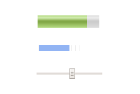
<meter>, <progress>, and <input type="range"> look like they come from different worlds in Chrome 80 on Windows.
To help fix this problem, the teams at Microsoft Edge and Google Chrome spent the last year collaborating to retheme and improve the functionality of the built-in form controls on Chromium browsers. The two teams also worked to make the focused states of form controls and other interactive elements like links easier to perceive.
These changes are available today in Edge on Windows, and may be seen in Chrome 81 as part of experiments. The chrome://flags/#form-controls-refresh enables the changes in Chrome 81 as well. The changes will roll out in Chrome 83 on Windows, macOS, ChromeOS, and Linux. See the updated release schedule for Chrome 81 and 83. Updates for Chrome on Android should roll out later this year.If you want to hear more about what's coming to form controls, take a look at Nicole Sullivan and Greg Whitworth's talk from CDS 2019.
A fresh coat of paint
The two teams wanted to make the controls feel like they were part of a matched set. This meant doing away with gradients and using more of a flat design inspired by current design systems.
As Nicole Sullivan, a member of the Chrome team, describes it:
We were going for beautiful, webby, and neutral. We hope that every design system would see a bit of themselves in the new designs and easily imagine how they might be adapted for their own branding.
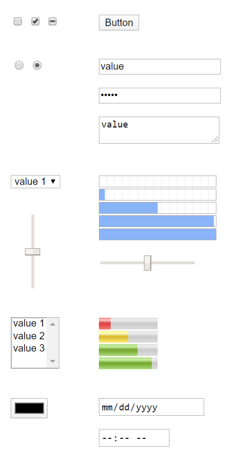
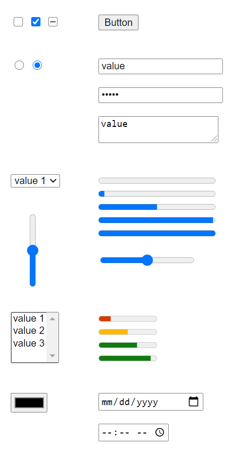
Below is a comparison of the form controls as they previously appeared in Chromium and as they appear after the redesign:
Left: Prior styling of form controls in Chrome 80.
Right: Controls as they appear after the redesign.
Improved accessibility and touch support
In addition to improving the default styling, the two teams also tuned up form controls' accessibility and enhanced touch support.
These changes are most notable in a few key areas:
A more visible focus ring
The focus indicatorsometimes referred to as the "focus ring"is an important accessibility feature that helps people using a keyboard or switch device to identify which element they're interacting with.
Previously, Chromium used a light single color outline to indicate the focused element. However, if the focused element happened to be on a similarly colored background, the ring would be difficult to perceive:
The previous focus ring on a similarly colored background.
The new focus indicator uses a thick dark ring with a thin white outline, which should improve visibility on both light and dark backgrounds. This is an easy accessibility win that automatically improves the keyboarding experience on a number of sites without developers needing to write any new code.
The new two-line design for the focus indicator ensures that it's visible on both black and white backgrounds.
Note that there are still some scenarios where the focus ring may be hard to perceivefor example, if a black button is on a white background, or if the focus ring is clipped by elements that are positioned closely together.
If you run into a scenario where the focus ring is hard to perceive, or if the new focus indicator does not match the design of your site, there are ways to style focus including the new :focus-visible pseudo-class, which provides fine-grained control over when the focus indicator is displayed.
Increased tap target sizes for multi-input displays
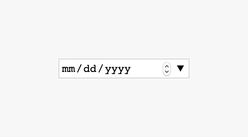
Over the past few years we've seen an increase in multi-input devices like 2-in-1 devices, tablets, and touch-enabled laptops. This means that touch becomes an important consideration for desktop. However, many of the existing form controls were not designed with multi-input surfaces in mind. For example, <input type="date"> works great on mobile, but the tap targets are much too small to be usable on a touch-screen laptop.
The previous design for <input type="date"> with small tap targets.
To improve functionality on touch screens, the updated controls will now have better flyouts, larger tap targets, and support for swiping and inertia when scrolling:
The new design for <input type="date"> with much more accessible tap targets
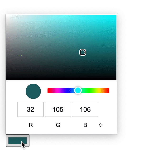
Improved color picker
Previously the <input type="color"> element was not fully keyboard accessible, meaning users relying on a keyboard or switch device couldn't use it. Along with a new appearance, the control is also now fully keyboard accessible and includes additional modifier keys (Control, or Command on Mac). These improvements let users jump by ten color values at a time.
The new <input type="color"> with improved keyboard accessibility.
More consistent keyboard access
Finally, the teams updated the ARIA role mapping of all the controls to match the recommendations in the HTML Accessibility API Mappings specification. This should provide a more consistent experience for anyone relying on a keyboard or assistive technology, like a screen reader, to access the page.
How you can get involved
While the design refresh is a much needed change, the two teams have also heard from developers that it should be easier to style the built-in form controls and plan to tackle that work next. If you're excited by the idea of improved styling, functionality, and possibly even new high-level components, the folks at Edge and Chrome need your help!
Test your sites
Try out the new form controls and focus indicator in Edge and Chrome Beta. If the design changes have negatively affected your existing sites or apps, let us know using this bug template. Or, if you find a related bug, give it a star! ⭐️ Starring is extremely valuable because it helps platform teams triage and decide what to work on next.
Tell us what you want to see
Much of the work on the new form controls was enabled through surveying developers, and interviewing design system and UI framework authors.
In an effort to help centralize this feedback and include as many developers as possible in the standards process, the team at Edge have created open-ui.org. If you work on a design system, or a UI component set, consider sharing your knowledge on Open UI to help classify and identify gaps in the existing form controls.
Posted by Rob Dodson, Developer Advocate
Source: https://blog.chromium.org/2020/03/up...and-focus.html


Related Discussions