Introducing New FACEBOOK Company Brand Logo

    Introducing New FACEBOOK Company Brand Logo

    Introducing New FACEBOOK Company Brand Logo


    Posted: 04 Nov 2019

    Facebook started as a single app. Now, 15 years later, we offer a suite of products that help people connect to their friends and family, find communities and grow businesses.

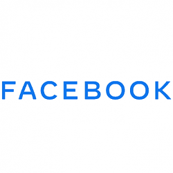
    Today, we’re updating our company branding to be clearer about the products that come from Facebook. We’re introducing a new company logo and further distinguishing the Facebook company from the Facebook app, which will keep its own branding.

    The new branding was designed for clarity, and uses custom typography and capitalization to create visual distinction between the company and app.


    People should know which companies make the products they use. Our main services include the Facebook app, Messenger, Instagram, WhatsApp, Oculus, Workplace, Portal and Calibra. These apps and technologies have shared infrastructure for years and the teams behind them frequently work together.

    We started being clearer about the products and services that are part of Facebook years ago, adding a company endorsement to products like Oculus, Workplace and Portal. And in June we began including “from Facebook” within all our apps. Over the coming weeks, we will start using the new brand within our products and marketing materials, including a new company website.


    This brand change is a way to better communicate our ownership structure to the people and businesses who use our services to connect, share, build community and grow their audiences.


    Source: Introducing Our New Company Brand | Facebook Newsroom
    Brink's Avatar Posted By: Brink
    04 Nov 2019


  1. Posts : 4,201
    Windows 10 Pro x64 Latest RP
       #1

    Anyone with any training or experience in design, would know that you never use All Caps for any type of Text based logo, It has been found to be many times more difficult to read ALL CAPS than a Normal Mixed Case wording.

    The experiment done many years ago involves placing the All Caps logo and a Mixed case version on a piece of paper then take a second piece of paper and use it to blank off the Bottom half of the "logo"

    Due to the way that the human brain works and learns to read - they concentrate on the top half of letters more than the lower half - and the top half of All Caps text is not as easily recognised as that of Normal mixed text.

    Hopefully F A C E B O O K have paid someone millions to create this logo, as anything that costs facebook money is a good thing in my opinion
      My Computers


  2. Posts : 2,075
    Windows 10 Pro
       #2

    FN FB.....
      My Computer


  3. Posts : 7,724
    3-Win-7Prox64 3-Win10Prox64 3-LinuxMint20.2
       #3

    Hi,
    lol caps is hard to read really
      My Computers


  4. Posts : 170
    Android
       #4

    Caps makes you read more slowly. Maybe FACEBOOK wanted an 'in your face' logo.

    It certainly doesn't look very graceful though..
      My Computer


  5. Posts : 1,750
    Windows 10 HOME 64-BIT
       #5

    Ugly as sin. My few cents.
      My Computer


  6. Posts : 56,850
    Multi-boot Windows 10/11 - RTM, RP, Beta, and Insider
       #6

    I'll go with Credtstarter's assessment. It's S C R E A M I N G ! ! !

    First thing you want to do is say stop yelling!
      My Computers


  7. Posts : 7,724
    3-Win-7Prox64 3-Win10Prox64 3-LinuxMint20.2
       #7

    Hi,
    Can't scream in type you're just showing your drama queen side
      My Computers


  Related Discussions
Our Sites
Site Links
About Us
Windows 10 Forums is an independent web site and has not been authorized, sponsored, or otherwise approved by Microsoft Corporation. "Windows 10" and related materials are trademarks of Microsoft Corp.

© Designer Media Ltd
All times are GMT -5. The time now is 00:36.
Find Us


Windows 10 Forums