How Do I Create A Circle With Sections and Percentages ?

Page 1 of 2 12 LastLast

  1. Posts : 166
    Windows10
       #1

    How Do I Create A Circle With Sections and Percentages ?


    I want to make a circle graph.

    How would I make one .......that would have for example 10 equal sections in circle, so that each one is 1/10th or 36 degrees of a circle ?

    How would I make one that uses percentages, so that if I want to make one with '10' sections but one represents 25%, 15%, 12 % etc....?

    How could I label the sections with a name in each section or create a line to the side pointing towards each section ? I will need it to identify the smaller sections that are 10%, 5%, 3%, 1%. They are too small to be able to 'write' on the inside of each section.

    I would like to potentially be able to make each section a different color and have a Color Index to the side.

    I don't have Photoshop but I have the standard Windows Apps and Windows Home Office.


    Thanks
      My Computer


  2. Posts : 4,201
    Windows 10 Pro x64 Latest RP
       #2

    Most if not all of the "office Suites" will have a graph module attached to the Spreadsheet option, Simply create a table with the number of labels you require in the first column and the percentage or other numerical value in the second column.

    You then use this data to create the graph using the tools in the program - Look for the option to create a "Pie Chart" Which should be in Excel or its equivalent.

    Word does have an option to insert a Graph that uses the same Code as Excel so that is an option if you need to include the graph in a document
      My Computers


  3. Posts : 2,734
    Windows 10
       #3

    Any Office Suite would do that
    MS Office.
    Word > Insert > Chart > Pie Chart. That will also Open Excel to input data.
    Excel > Select data > Insert > Pie Chart.
    Powerpoint > Insert > Chart > Pie Chart. That will also Open Excel to input Data.

    Exactly the same sort of procedure for any Office Suite, standard stuff.
      My Computer


  4. Posts : 166
    Windows10
    Thread Starter
       #4

    I went to Powerpoint and then Design. I found a pie chart and inserted my entries and when I enter the percentages, the pie changes..........good.

    There is also something at the bottom that defines each color, although it takes up a lot of room.......but it's okay.

    If I wanted to delete the color index at the bottom and write the name of each entry within the chart, can I do that with PP?

    When I get it all done, do I just print it or can I copy and paste to Word?

    I don't use PP or Excel very often. Perhaps 2,3 times in as many years.

    I just use Word.......

    Thanks
      My Computer


  5. Posts : 4,201
    Windows 10 Pro x64 Latest RP
       #5

    You should be able to "cut out the Middleman" to coin a phrase ... open word and select to Insert Chart that will allow you to select various options and build the exact result you wish - The Key that shows the colours is fully customisable for position, size and colours, normally you just need to right click on an element of the chart and an options menu will allow you to alter things...

      My Computers


  6. Posts : 166
    Windows10
    Thread Starter
       #6

    Barman58 said:

    I appreciate your help......I am getting closer but........the chart was filling in just fine and I continued to add the entries and when I looked down they had changed.

    Why is the 6.25 or about 1/16th of the chart being used to fill all the entries?

    It has to be a simple fix but I guess I have not found the right link yet........


    How Do I Create A Circle  With Sections and Percentages ?-screenshot-10-.png

    I have 16 entries.......the AFC........and I want them equally spaced in the pie......but somehow the document changed on me.

    Thanks
      My Computer


  7. Posts : 166
    Windows10
    Thread Starter
       #7

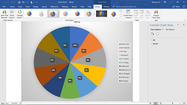
    Okay, I have gotten a bit further. I figured out that the reason the graph was so small is because one of my entries was 625 and not 6.25.

    I also found that if I scrolled to the top that I could choose several different graph styles.

    So far so good.


    How Do I Create A Circle  With Sections and Percentages ?-screenshot-11-.png
    But...... why was I able to enter 16 teams on the excel sheet but only 11 showed up on my graph ?

    BTW, I intend on doing the AFC as well, but I gotta get past the NFC first.
      My Computer


  8. Posts : 166
    Windows10
    Thread Starter
       #8

    Okay, I figured out how to rename the colors to the teams......thanks to the posted video.

    But.........see how the NFC is centered in the middle of the page ?

    Can I align it to be centered above the middle of the graph ?
    Last edited by RaymondWindoz10; 04 Aug 2018 at 23:24.
      My Computer


  9. Posts : 166
    Windows10
    Thread Starter
       #9

    I figured out how to align the title by deleting the legend to the right.
    But I still have not figured out how to add additional data.

    I saved the document but I did not save the excel doc that I used to enter the data. How do I recall it or
    create a new one to add new data......?

    How Do I Create A Circle  With Sections and Percentages ?-screenshot-12-.png
      My Computer


  10. Posts : 625
    Windows 10 Pro x64
       #10

    What exactly are you doing with the NFL Teams? I like football, so i'm curious.
      My Computers


  Related Discussions
Our Sites
Site Links
About Us
Windows 10 Forums is an independent web site and has not been authorized, sponsored, or otherwise approved by Microsoft Corporation. "Windows 10" and related materials are trademarks of Microsoft Corp.

© Designer Media Ltd
All times are GMT -5. The time now is 14:58.
Find Us


Windows 10 Forums