
New
#751
Windows 10 Themes created by Ten Forums members
-
-
-
-
New #754
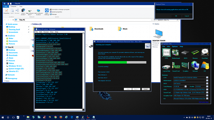
I'm undecided if I want to offer Dragon as an Aero Hybrid theme. It seems to be missing something, and the extreme dark to white contrasts(where colors can't be changed in Aero) are just toooooo.... I don't know? Just too???!
Here is the major fail; hard coded black text:
The rest of the screenshots show what I mean by "too???" in Windows.
-
New #755
Is it your Subzero Dragon HC theme using Aero instead of AeroLite?
It's indeed too...
But worth the effort!
It seems the base (Aero) theme was meant to be white, proven by those UI parts that are not affected by the theme dark color specs.
It might still work with some grayish theme, not too dark, for now. That way the blending with the white parts is easier on the eyes.
-
New #756
I've already posted a couple of nicer gray themes, I try for different colors to go with different wallpapers. But some AeroHybrids don't transfer to HC well, and the reverse, HC to AeroHybrid, because of hard coded colors and default link colors, that cannot be changed with out patching(and that ship has lifted anchor a few builds ago:)).
Personally I don't mind the white left showing, but for people with eyesight problems, or live on their computer, it would be nice to be able to offer something.
The problem with patching, when it worked, is , in Win7 it broke MMC, in Win8.1 it broke right click in all apps and start screen. And... in Wín10 it broke View Reliability History in Control Panel\All Control Panel Items\Security and Maintenance, plus right click in start menu.
-
New #757
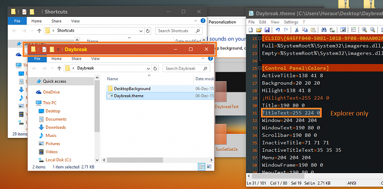
My latest theme doesn't do much but I'll go for the orangy highlights:
Sunset3 Theme:
Using good ol' Aero.
Text highlight is changed.
For VirtualBox users: colors are different that in default themes.
Explorer window title: using its own color...
And some gray instead of white, but not too much.
For the inactive title bar I'm using;
Inactive Title Bar Color - Change in Windows 10 - Windows 10 ForumsCode:[HKEY_CURRENT_USER\SOFTWARE\Microsoft\Windows\DWM] "AccentColorInactive"=dword:00474747
Title text is in bold:
EDIT:
If the Yellow title is annoying, you can find the updated theme version on the next page.
(White for Explorer - Black for Resource Monitor sections)
That's all.Last edited by Hopachi; 06 Dec 2015 at 11:52.
-
New #758
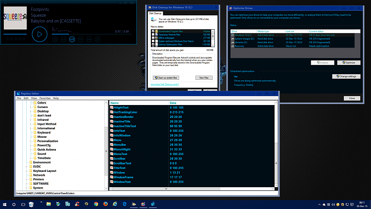
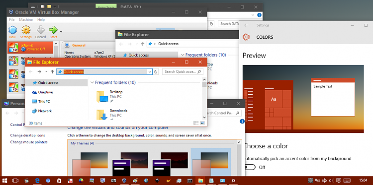
Aero theme test:
Some control panel colors are well-applied, others not.
Menu colors are changed but not in all programs.
Explorer left-pane is also affected by some menu color.
-
-
New #759
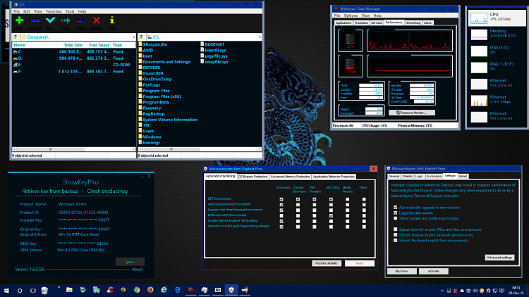
Nice Horace, good to see you posting a theme here too.
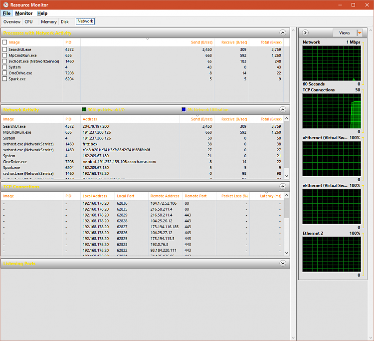
When I want to check how a theme works over all I usually open up resource monitor and check there:
yours:
One of mine using some of Keith's pictures at Deviant Art as the color base inspiration:
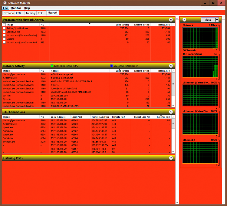
(yup that's International Warning Orange:))
By the way I really like that background.
-
New #760
 #
#
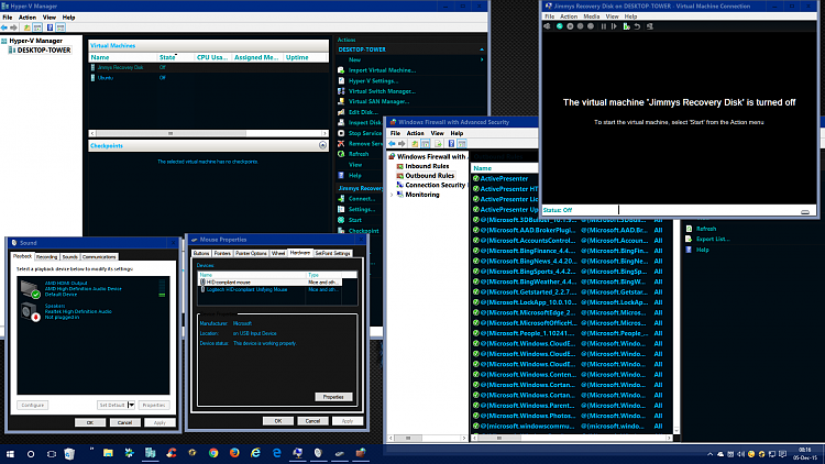
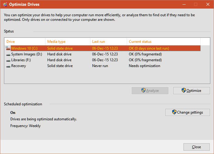
Oh Optimize drives looks really nice with this color combo.
and effects on 3rd party system theme following software:

 Thanks Horace!


Related Discussions
