New
#611
Works with 10586.
Finally...some sweet darkness...
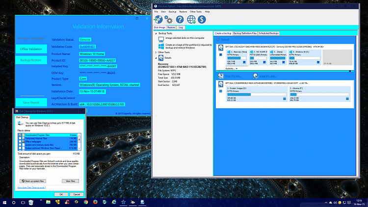
I'm working on a new Blue based AeroHybrid color theme. Here's what I have so far, any comments, questions or advice on the coloring is very welcomed.
I'll post it with wallpapers when I feel it has readability in all facets of use.
The reason I chose a light blue window background is, the coloring of text shows in File Explorer in the Navigation Pane. If I use a dark blue background, I'll need light blue(or colored) text, and in File Explorer on the white background it's barely readable. So I reversed what I actually wanted. It wouldn't be a problem if I could patch the theme colors, but since build 10158 patching has been totally brokenFor those who don't know, patching replaces the white background with the chosen window and app background color(like high contrast, but keeping AERO.
Ok enough blablabla, here's what I have now:
Notice the dark blue text in navigation pane:
and now the effect on Windows and some 3rd party apps:
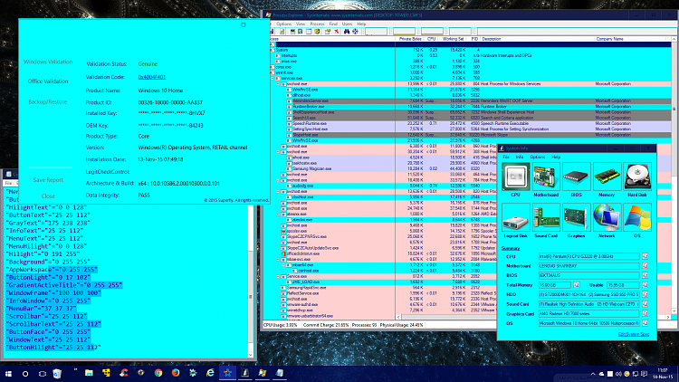
I'm trying to find the right shade, but the problem is readability with dark text font. I had tried light on dark, but that doesn't work so well. Maybe a red or green based/blue instead of a yellow based/blue(aqua). I want this to be readable in a well light room, like my last one is, but yeah that aqua is a bit harsh on the eyesl, isn't it?
Not quite there yet, I'm having text color problems on some parts, but after a few changes: