
New
#1011
Windows 10 Themes created by Ten Forums members
-
-
New #1012
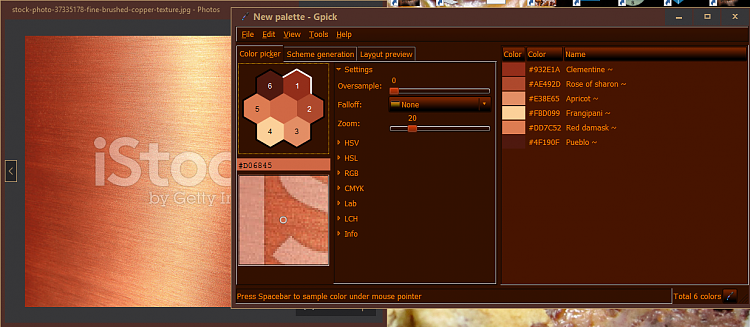
No I mean the palette color can be generated from that image colors, light & dark. You list up some nice colors from the image, then you use them in your theme elements, for instance in Gpick palette color picker:
Yeah no reflections, we'll have to live with that. I'm not gonna uxPatch anything since we know what happens next.
You're right about the image and as a background... I don't want to turn it into a Mac either, we can do that some other time.
Last edited by Hopachi; 08 Jan 2016 at 17:52. Reason: oops! mistyped 'sue colors' instead of 'use colors'
-
New #1013
-
New #1014
I was just noticing nice the coloring came out(I haven't had time to explore what all is/was effected by the color scheme). The one thing that bugs me and turns me off about using high contrast all the time is, how the live tile are messed up, and any pictures on them get a bit covered.
Oh I've gotten some color RGBs before using Paint and it's color picker:

Thanks @Rjmach, you can also publish the changed theme here to share.
-
-
-
-
New #1018
I have had an "AHA! moment!
Because of Fuchs Disease (corneas), I need lots of contrast without brightness. It has taken me awhile to figure out all the ins and outs of my crappy sight. Wraparound sunglasses, even on cloudy days, changing my monitor(s) to a dimmer white, etc.
I had often wondered why Settings>System Display, Notifications . . . had a setting for "Change the size of text, apps and other items" that didn't seem to do anything at all. Every time I tried to change the slider bar to about 115%, it just jumped back to 100%.
Yesterday, while playing with the slider, I accidentally shoved it over to the 125% mark. Glory Be! My font was enlarged to 125%. I can see so much better now. The only thing I don't care for is that my fonts seem to be a little more bolded than I'd like. Yes, the size of that word changed and it got a whole lot darker (bold that wasn't bolded).
One thing of note is that when changing the size of text on dual monitors, you will need to change both of them. Yeh, I'm still getting used to my "duelling" monitors. I've found that changing my primary monitor to 125% and my secondary one to 150% works well. Reason for the second monitor's larger text is that sometimes when writing, I need to refer to another document, and it's just easier to see the "darker" and larger font.
Oh, for those (like me) who haven't learned all about dual monitors, just click on each monitor to change things around.
-
-
-


Related Discussions
