Windows 10 Context Menus not the Same - 2 Computers

Page 1 of 2 12 LastLast

  1. Posts : 8
    Windows 10
       #1

    Windows 10 Context Menus not the Same - 2 Computers


    Hi,

    I am quite interested if anyone has any feedback on this. I have 2 different Windows 10 machines...

    1. A clean install of Windows 10.
    2. An upgrade from Windows 7.

    The right-click context menus are very different on each. I have imported the same themes and tried to match as many of the tweaks on the 2 machines.

    For starters I have disabled Segoe UI completely, and replaced it with Arial. Also, Font Smoothing and Cleartype are completely disabled.

    For the clean 10 machine, I get clean white context menus, both on the desktop and taskbar... no blurring.
    For the 10 machine upgraded from 7, I get a gray blurry context menu, and a dark gray one on the taskbar.

    See the compare pick below. Click on it to view full size to see the true compare.

    Windows 10 Context Menus not the Same - 2 Computers-compare.png

    Anyone have any thoughts on this? I am one of those that cannot stand cleartype, especially on desktop monitors.

    Thanks,

    Steve
      My Computer


  2. Posts : 5,169
    64bit Win 10 Pro ver 21H2
       #2

    Hi Steve,

    I suspect you have two different versions and one has not yet updated to the latest version 1511. Try the winver command in a Command Prompt window.

    Phil
      My Computers


  3. Posts : 8
    Windows 10
    Thread Starter
       #3

    Hi Phil,

    Yes, you are correct! One system did not upgrade.

    But the bad news is that now BOTH systems have the blurry context menus, with the dark gray one from the taskbar.

    Other areas area affected also. Cleartype settings and font smoothing in advanced settings are ignored. So if you look a the pick, now both systems have the ugly context menus.

    Why can't Microsoft simply allow folks who do not want any cleartype to stick with no cleartype! It is quite maddening!
      My Computer


  4. Posts : 5,169
    64bit Win 10 Pro ver 21H2
       #4

    I understand that it is down to personal preference and for me I prefer to have cleartype ON. It is odd that your text is blurry and I wonder if this is down to some graphics setting. It would be worth checking that your display is set to the correct resolution for your monitor, normally it all defaults to the correct setting but it might be worth checking as monitors will quickly show blurred text if they are not at their native resolution.
      My Computers


  5. Posts : 8
    Windows 10
    Thread Starter
       #5

    Hi Phil,

    It is a personal thing. Lets call us a pretty large "subgroup" of users that just cannot take cleartype. Who knows what it is! Microsoft does seem to ignore us outcasts but I am sure we are in the millions.

    Whether it is Windows 7, or 10, or 8.1, I have to have cleartype turned off. The only exception may possibly be if I used a very high DPI monitor. One with very tight pixel density... such as what I see on my smartphone. Then the smoothing is OK.

    It is quite interesting... almost like that "is the dress blue or gold" question that came up several months ago on the Internet. Some just cannot be comfortable with Cleartype, and it just seems like Microsoft has abandoned this group altogether. It takes hacks to make using the computer comfortable.

    Steve
      My Computer


  6. Posts : 8
    Windows 10
    Thread Starter
       #6

    Hi,

    For those interested, it appears we will have to live with the blurry context menus for a short time as you cannot turn Cleartype off of these menus. Hopefully Microsoft will address this in a future build.

    Here is my post over at Microsoft... with a reply.

    http://answers.microsoft.com/en-us/w...0-1e67e66c47ec

    Steve
      My Computer


  7. Posts : 5,169
    64bit Win 10 Pro ver 21H2
       #7

    Hi Steve,

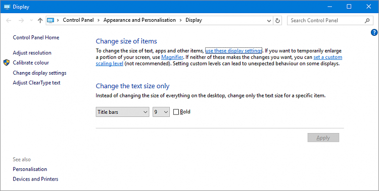
    Thanks for the update and I hope they fix it soon for you! However, I just came across another post that suggested adjusting the "set a custom scaling level" in Control Panel can make a difference to the blurry text. See screen shot below for where to find this option. Try adjusting up and down, some people seem to prefer 125%.

    Windows 10 Context Menus not the Same - 2 Computers-2015-11-28.png


    Cheers,
    Phil
      My Computers


  8. Posts : 8
    Windows 10
    Thread Starter
       #8

    Hi Phil,

    I used standard 96 dpi settings, or that is unscaled at 100%. I think I did mess with it a little. Everything else is fine, it is pretty much just the context menus and I believe some message boxes in 1511 that were changed, and the cleartype turned off settings (according to the Microsoft tech) are not applied to these windows. Hopefully Microsoft changes this in a future build.

    Thanks,

    Steve
      My Computer


  9. Posts : 181
    Windows 10 Pro x64
       #9

    stevehal said:
    Hi Phil,

    I used standard 96 dpi settings, or that is unscaled at 100%. I think I did mess with it a little. Everything else is fine, it is pretty much just the context menus and I believe some message boxes in 1511 that were changed, and the cleartype turned off settings (according to the Microsoft tech) are not applied to these windows. Hopefully Microsoft changes this in a future build.

    Thanks,

    Steve
    Have you tried updating the video drivers? Generally, blurry text is indicative of scaling above 100%, and/or cleartype turned off. Once you change the scaling, reboot, and the new value should be applied. If you've already done that, I would try changing the scaling to a higher value, reboot, then change it back to 100, and reboot again.

    What this is not is an issue/bug/problem with Windows 10; the issue resides with the end user's settings. It would be wonderful if users stopped jumping to the conclusion that every problem they have is the fault of the OS... majority of issues thus far experienced by users with Windows 10 can be attributed to either user error, or the user's environment, and not Windows 10 itself.
      My Computer


  10. Posts : 8
    Windows 10
    Thread Starter
       #10

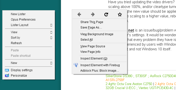
    I differ in this opinion that it is not the fault of the OS. I never use scaled fonts other than default 96dpi (or now in Windows 10 it is 100%). As you say you mention blurry fonts with Cleartype turned off. And this is correct! Some fonts look terrible with Cleartype off. However, I am one of those folks that cannot use Cleartype. It bothers my eyes. There are others this happens too, in fairly large numbers actually. So, I need to do several things to make my all day in front of the computer more comfortable. This means remove Segoe UI and switch it out with Arial via a few registry tweaks. It also means turning off Cleartype. With this I get most of the font look I am comfortable with. But in the latest 1511 build of Windows 10, Microsoft did change some things and left Cleartype turned on in several areas. The tech from Microsoft acknowledged this via the link I posted above that Cleartype settings are ignored in the areas I was talking about (there are actually other areas of Windows 10 where Cleartype is kept ON and the user does not have a choice). If you look at the pic below, the popup menu on the left is what Windows now has, and you see how I like it on the right with the post and the browser popup. I do turn Cleartype on at times as part of the software development process, but 99% of the time I need to keep it off.

    Important: Make sure you click the image to see it unscaled.

    Windows 10 Context Menus not the Same - 2 Computers-compare2.png
      My Computer


  Related Discussions
Our Sites
Site Links
About Us
Windows 10 Forums is an independent web site and has not been authorized, sponsored, or otherwise approved by Microsoft Corporation. "Windows 10" and related materials are trademarks of Microsoft Corp.

© Designer Media Ltd
All times are GMT -5. The time now is 15:20.
Find Us


Windows 10 Forums